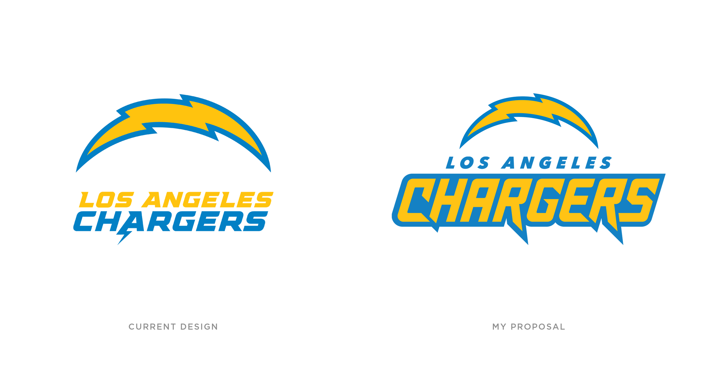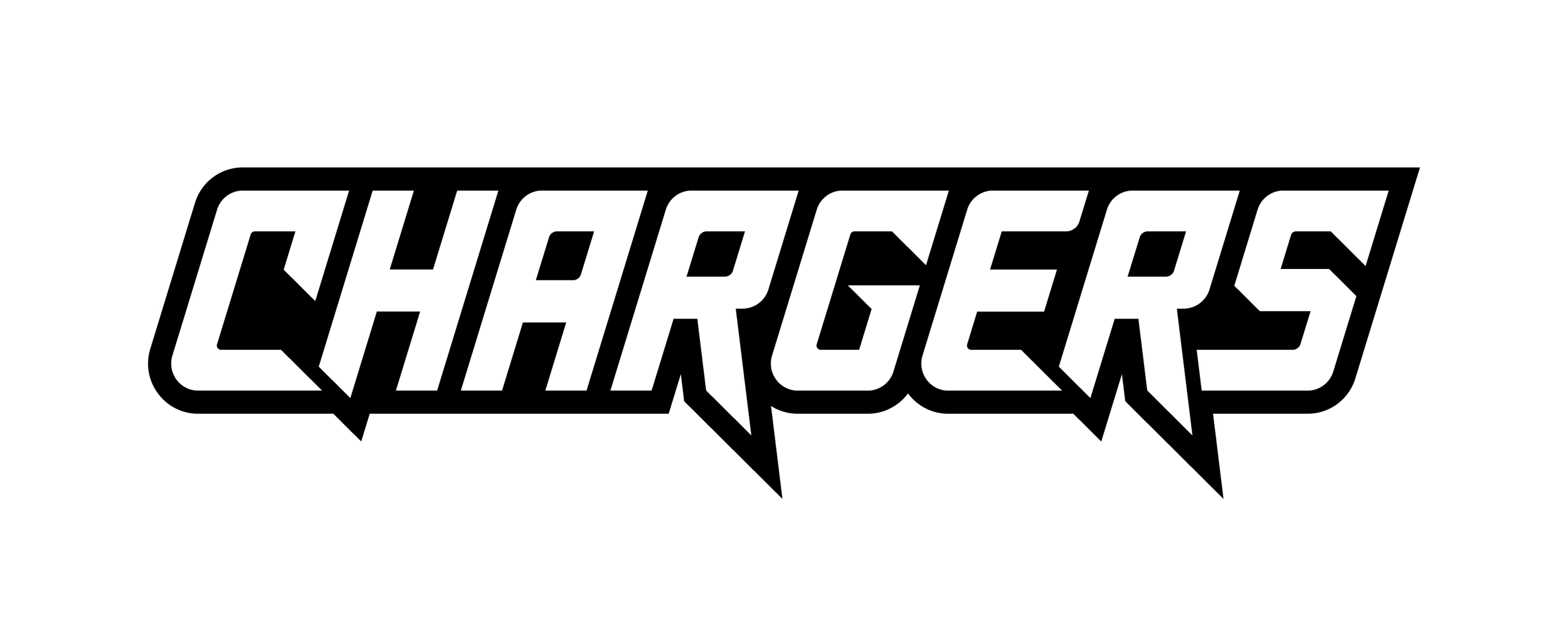
Chargers Logotype
Although they have the nicest jerseys in the game, I always thought that their current logotype (and older versions) doesn’t do them justice. Its design lacks dynamism and fails to have the same aggressiveness as its counterpart logo, the bolt. Here, I propose a new design that’s inspired by the numbers on the jerseys they wore back in San Diego; one that is more consistent and says more about who they are as a team. And no, I ain’t touching the bolt. It’s iconic to us fans!